ABS SINGAPORE
Event Design Identity
Creative Direction · Event Identity · Art Direction ·
International Stakeholder Management
Credits:
Creative Direction & Art Direction — Leandro Dourado
Visual Identity Development — Leandro Dourado + Digital.Ws
International Stakeholder Management — Leandro Dourado +
Mallika Ramakrishna
Design & Production — Digital.Ws
Client / Stakeholder — Embraer APAC Office
BREFING
ABS (Airline Business Seminar) is a recurring Embraer event held in different markets and regions, with high-level attendants. Each edition requiring a visual identity that reflects its location while remaining consistent with the Embraer Commercial Aviation brand.
For the Singapore edition, I was responsible for translating the local office's needs and expectations into a cohesive event identity, working across Brazil and Singapore and coordinating the creative development with their local suppliers.
The challenge was to create something that felt specific to Singapore without losing the visual consistency and brand recognition of Embraer Commercial Aviation.
PROCESS
The starting point was the local context.
I worked directly with the Singapore office to understand the event, its audience, priorities and cultural considerations. Including what they wanted to emphasize visually and what should be avoided.
From there, I translated those requirements into a creative brief for our agency in Brazil, working through multiple visual directions and refining the concepts before presenting a focused selection to the Singapore team.
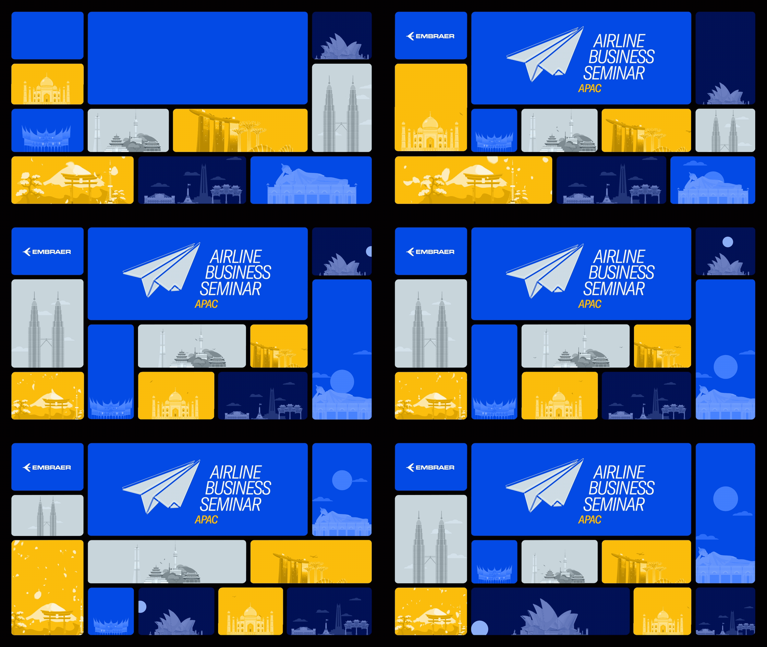
The final direction drew inspiration from Singapore's visual and cultural identity, incorporating recognizable local elements into a modular graphic system.
At the same time, the identity remained within Embraer's established visual language, using the company's blue and yellow palette and a controlled range of blue tones to create variety while maintaining brand consistency.
KEY VISUAL
The creative direction started with a trend study.
At the time, modular bento-style layouts were becoming increasingly relevant in visual design, particularly across Asian design references. I saw an opportunity to use this modular structure as the foundation for the Singapore edition.
The grid-like composition also created a natural framework for incorporating visual references from the location.
I developed a visual language using recognizable elements of Singapore: architecture, landmarks, cultural references and local visual cues . All arranged as a modular pattern.
This approach allowed the identity to feel connected to its location while establishing a flexible system that could be translated across multiple event assets.


DESIGN ASSETS
The identity was translated into approximately 20 different assets, including:
-
Event badges
-
Lanyards
-
Invitations
-
Save-the-date communications
-
Website and registration banners
-
Presentation templates
-
Decorative banners
-
Table and venue materials
-
Animated key visuals
-
LED screen content
-
Digital banners
-
Other printed and digital event materials
The challenge was not simply to reproduce the same artwork across different formats, but to ensure that the visual language remained cohesive across print, digital, physical spaces and motion.
Throughout the development, I ensured that the Singapore-specific visual language remained aligned with Embraer's broader brand identity — particularly its established color palette and visual principles.
At the same time, I worked to give the event enough local character to avoid feeling like a generic corporate template.
The result was a balance between global brand consistency and local relevance, with the modular visual system allowing the same creative idea to adapt naturally across different formats and applications.


INTERNATIONAL COLLABORATION
One of the biggest challenges was not purely creative, it was operational.
The project involved coordinating between Brazil and Singapore, working across different timezones, managing feedback cycles and keeping production moving against fixed event deadlines.
I acted as the main creative point of contact between the local office and the agency, translating feedback in both directions and filtering creative options before they reached the client.
When urgent changes came in close to production deadlines, I also stepped into execution myself when necessary, making adjustments directly to keep deliverables moving without compromising the event schedule.
This combination of creative direction, stakeholder management and hands-on execution was essential to delivering the project on time.
OUTCOME
The final identity provided a cohesive visual system for the Singapore edition of ABS, translating the character of the destination into a branded event experience while maintaining consistency with Embraer's Commercial Aviation identity.
The system was successfully extended across approximately 20 physical and digital touchpoints, from the first invitation through the event environment and on-screen communications. The local team was very happy with the outcome.
Beyond the visual output, the project demonstrated the ability to lead a creative process across cultures, time zones and stakeholders, balancing local relevance with global brand consistency while keeping a complex production on schedule.